By Dave Cool on the Bandzoogle Blog
When a fan visits your band’s website, you don’t want them to have the same reaction as the in the thumbnail (be sure to check out the video at the bottom of the post). Your website should be a place fans enjoy visiting to get your latest news, hear your latest music, watch your videos, and shop from your online store. Here are some things to avoid that could be turning fans away from your site for good:
1. Doesn’t work well on mobile
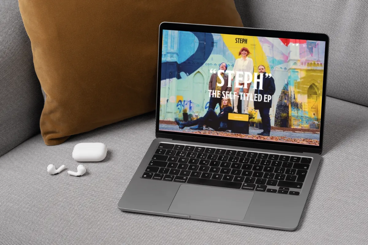
More and more fans are accessing the web from mobile devices, so it’s extremely important to make sure that your website and all of the features work on mobile. If a fan visits your site from their phone and they have to zoom in to read content, or your events calendar doesn’t load, or your online store doesn’t work, you could be losing sales. Bandzoogle members don’t have to worry, as all of our themes are responsive, and all of our features including music players and our Store work perfectly on mobile!
2. Useless intro page
Intro pages should serve a specific purpose, and not just be an extra step for fans to access your website. So unless you’re promoting something *temporarily* like a new album, new video, or a crowdfunding campaign, don’t make fans click through an intro page that simply has your photo each time they visit your site.
For tips on creating a landing page: Musicians: How to Properly Use a Landing Page on Your Website
3. Unclear navigation
When creating your navigation, remember to keep it simple. People have very short attention spans, and not a lot of time. If they have to think about what content *might* be in a certain section of your site because the name is fancy/cute/artsy, chances are, they’re going to skip it.
Here’s how to create the navigation for your website: The Magic 8: Essential Menu Options for Your Band Website
4. Too much content
Often bands try to do too much on their website. There are so many tools, features, and widgets out there, but you don’t have to use them all. Simple really is better. Make it easy for people to find the content that they’re looking for, and don’t clutter up pages with every social media feed possible.
Want some tips on how to unclutter your website? Check out: Keep It Clean: 10 Ways to Unclutter Your Band Website
5. Isn't updated
If a fan visits your site and doesn’t see any news, or any new music or videos, they might not come back again. Be sure to update your website first with your latest music, videos, and photos to keep fans coming back. If you have a blog or a news page on your site, make sure to keep it up to date with the latest news from your career.
Not sure what to blog about? Here are 13 Topics That Musicians Can Easily Blog About
6. Music autostarts
Some musicians love the autostart function on music players, but many fans do not. Countless people have no doubt startled their co-workers with blaring music that suddenly autostarted with the speakers on full blast, or created an unwanted mix with whatever they were already listening to. Have a clear play button on your website and give fans the option to press play.
7. Text is unreadable
There isn’t much point in having information on your website if fans can’t read it. Avoid using color fonts for your content, which are harder to read (although fine for highlights and links), and stick to white text on dark backgrounds, or black text on light backgrounds to be safe. Also be sure to use a reasonable font size for your content. Don’t use any sizes below 14 points, and DO NOT USE ALL CAPS FOR ENTIRE PARAGRAPHS.
8. Has tons of ads
Your website should be focused on your music and your career. Don’t put a bunch of ads that aren’t related to your music. They probably won’t match the look of your site, are a distraction for visitors, and chances are you’re not going to make much money from them. Focus instead on selling your music and merch to generate revenue from your website.
This guy did *not* enjoy the website he was visiting…
Related articles