__________________________
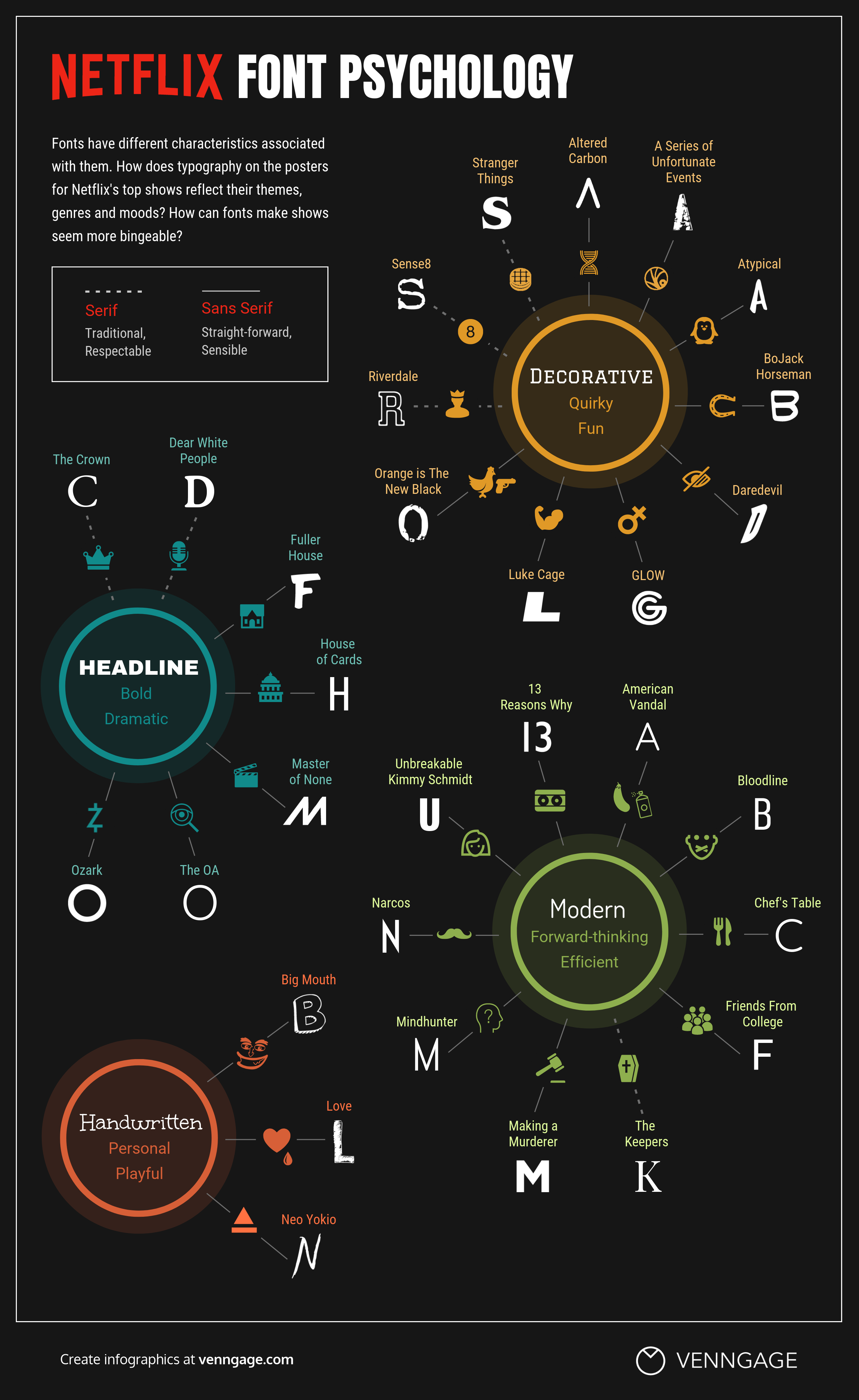
Guest post by Bobby Owsinski of Music 3.0Fonts are a big part of our lives. Every piece of marketing that you’ll ever release probably has or will have at least a couple of fonts, so instead of just picking them at random because they look nice, it’s best to at least have an idea of the power they have. Each one has its own characteristics and makes a huge difference in how our message is perceived. Right now, no company does that better than Netflix with its original shows.Vennage actually did a study and came up with this handy chart that outlines the font psychology regarding show titles. As you can see, you can break them down into 4 categories – decorative, headline, modern and handwritten. Decorative is considered quirky and fun, headline is bold and dramatic, modern is forward thinking and efficient and handwritten is personal and playful. Netflix is very cognizant about font psychology and even has its very own font, which it calls Netflix Sans. Take a look at the chart and see what you favorite show uses.