Choosing The Best Font For Your Musical Brand
 Becoming a successful artist will, on some level, always necessitate a certain amount of branding, and a huge part of your visual identity comes from the font you choose. In this piece we look at how to determine which will work the best for you.
_____________________________
Guest post by Bobby Owsinski of Music 3.0
Everyone in the music business is ultimately a brand, and the ones that develop theirs are ultimately the most successful. Artists, bands, musicians, producers, even indie record labels, have a tough time discovering their brand though, and in some cases they don’t know where to start. In the second edition of my Social Media Promotion For Musicians handbook there’s a specific chapter on branding that describes how to begin with 3 easy things – settling on a name, picking a color, and picking a font.
The name causes a lot of confusion sometimes because people will use a one that they’re not comfortable with instead of what feels or sounds right. Some easy cases here goes to first names, where an artist might call himself Victor when he really feels better with Corky, or Maureen instead of Mo.
Picking a color is similar, where although there’s a great deal of science around colors, there’s also personal preference that goes with your brand. You don’t want black or brown when your image is flowery, or blue when it’s hot and passionate. You must pick a color and use it everywhere (website, social profiles, posters, business cards, etc.) for it to be effective.
Picking a font that describes you is also one of the keys to a brand but it’s a little more difficult because there are so many. Like a color, you have to use it everywhere once you pick it, but what to choose? We touched on this a bit last week on the psychology of Netflix fonts, bu there’s way more to it. Luckily there is some guidance with the help of this handy chart.
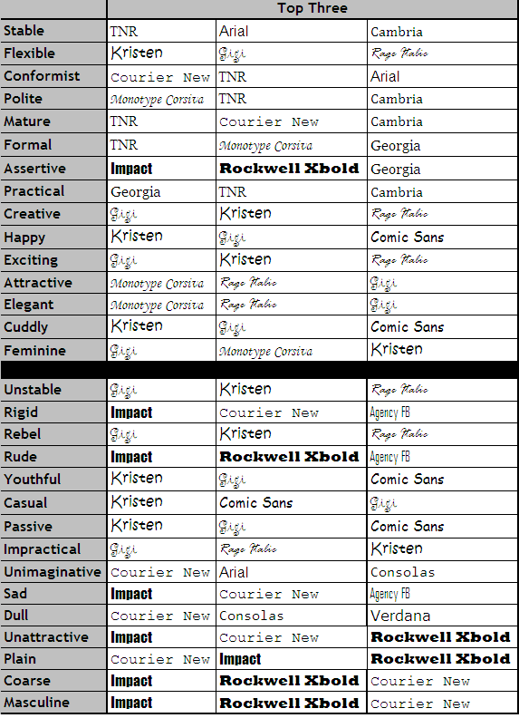
This is from a groundbreaking study done back in 2006 by the Software Usability Research Lab at Wichita State University. It shows the top 3 fonts for each descriptive word that might describe your brand.
In looking over the chart, some of it seems very logical while others (Rebel, Unattractive, Exciting) seem to go counter to what you might think. That said, there’s a lot of research behind the choices so they’re worth considering.
You have to be comfortable with that choice however, since if you’re branding yourself, your music or your band correctly, you’ll be using it for a long time.
You can read more from Social Media Promotion For Musicians and my other books on the excerpt section of bobbyowsinski.com.
