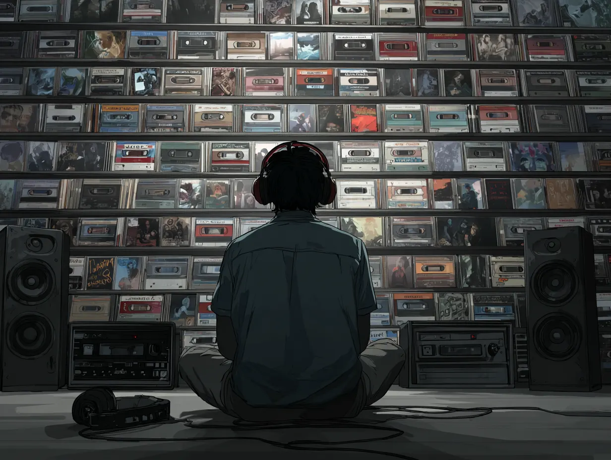
With the onset of the streaming age, you might think album artwork has lost some of the relevance it once had in the days of retail, but the reality is that having catchy visuals is more important than ever.
Guest post by Sara-Lena of BlackbirdPunk
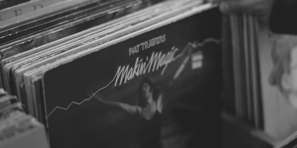
The artwork of an album or single has been always important in the music industry. At least since the invention of physical products. If you wanted your vinyl to stand out in a record shop, you needed a catching look.
What is more, now in the streaming era, artwork has become even more important. For once, the competition on Spotify and co is fierce.
Also, if your music is happening on a playlist, you need your cover art to catch the listeners eye. This way you can ensure the listener checks your profile out and not just skip ahead.
One step into making your release iconic is to have good iconography. That means:
The visual images and symbols used in a work of art or the study or interpretation of these.
*source: Oxford Dictionary
Important to realise, the artwork is just one element of your visual identity. You can use it as the masterpiece that inspires the rest of your assets.
The more your other assets such as social media headers or even posting align with your artwork the better. However, you might wonder, what makes a good cover art?
What makes a good artwork?
First, it needs to make you happy. There’s no use trying to be cool or trendy if you hate it at the end.
Making it through a music release timeline can be tough. For once, having an artwork that you love can be one of the things that will help you.
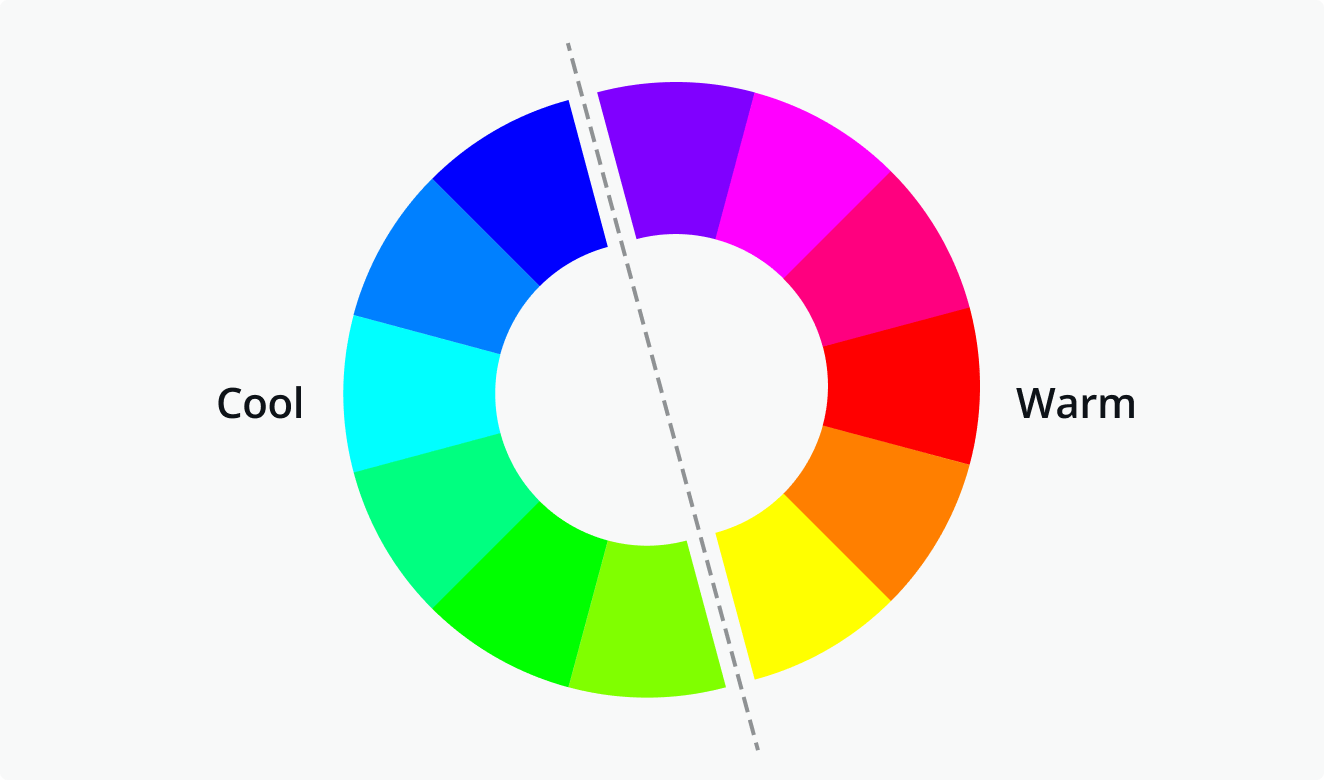
When it comes to colours on your cover art there are mainly three concepts. You can either choose complementary colours. For example, you could use blue and yellow.
Next, you could use an analogous colour scheme. That means choosing colours that are in the same family. For example, using all blue tones or all yellow tones.
Lastly, you can use a so-called triadic scheme. As a matter of fact, this means choosing colours that a equally placed on the colour wheel.
Of course, you can also be monochromatic and just use one colour. Like The Beatles did with The White Album.
Typography is an important part
Of course, you want to have some text on your artwork. Having your band or artist name on it as well as the title of the release is very common.
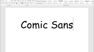
What is more, the tracklist and inner sleeve also need information and text. Therefore, choosing the right font is important. We have many emotional connections to fonts. Some like inherently funny to us like Comic Sans.
You can either use all the same font or you mix it up.
The typography on the front of the cover can be more artistic than on the back, where readability is more important.
*source: 99designs
Equally important is the overall artistic approach. Make sure it really matches the music inside the cover art. That means, if your music is really calm and slow there’s no use in having a vibrant artwork with extravagant typography.
On the other hand, if your music is upbeat and fast you don’t want moody and melancholic artwork.
How to design your artwork
Many musicians work with a small budget or are going down the DIY route. There are many tools you can use for designing your own artwork. One good tool is Canva.
Here you can even find a template for artwork. This is crazy, it already has the right measurements. What is more, you can easily upload your photos and even scale them to the size you want.
Cover art design tips to ensure your music goes live
https://diymusician.cdbaby.com/releasing-music/common-cover-art-mistakes-that-will-get-your-music-removed-from-streaming-services/embed/#?secret=GqxpgbuwCsHere’s a good example of how to use Canva for your artwork.
Alternatively, you can use freelance platforms like Fiverr. Here you can search for skilled designers that can design the artwork for you.
What streaming platforms require from your artwork
There are certain requirements your artwork needs to fulfil in order to be eligible for streaming services. For once, the title on the artwork and in the meta-data needs to be the same.
Of course, take care to not do any copyright infringement. Also, don’t include any advertising like ‘new’ or ‘just released’.
Quick Guide To Spotify Image Sizes
Streaming didn’t destroy the need for album art. It made it more important.
*source: LANDR
Also important to keep in mind, most people use streaming on their mobile phones. This means that your artwork needs to stand out on even a small screen.
Using stark contrasts or strong colours can help your artwork to stand out. You can take a little test. Scroll through Spotify on a playlist and see what artwork catches your interest. What does this artwork have that kept you interested?
Creating artwork is often the first step in the music release timeline. It is a real commitment to pull through with the release. Also, it transports the music to the outside and gives a first taste of what to come.
Make sure to have artwork you are really happy with. This way, your release will stand the test of time!