The look and feel of any artist website is hugely important to audience development and fan engagement. Here, we break down seven visually stunning layouts both you and fans will love.
Guest post by Anita Cazzola from the Bandzoogle Blog
Whether you are just getting started with a new band website design, or updating your site for a new project in the works, Bandzoogle’s platform provides great tools to expand the possibilities of your website layout.
No matter which band website template you choose, there are many ways to customize the layout to create a look that really works for your specific needs and aesthetic.
When building a website for your band or other musical project, it is important to lay information out in the clearest way possible, while also being true to your branding and values as an artist.
The “Image and Text” feature is one of my favourite features to use when creating unique layouts for website pages. It is a super versatile feature and ensures clean formatting across all devices.
I’ll show you how to use this feature, in combination with section customizations, to make 7 band website layouts for various purposes on your website.
First off, I will explain all the elements of the “Image and Text” feature that can be used or omitted as needed:
- Image: Of course, you are able to add an image to the “Image and Text” feature. This image can be cropped as a square, circle, or at 5:4 or 16:9 ratios. You can also add a hyperlink to this image in the “Image link” area. Be sure to optimize your images for the web before uploading them to your website.
- Heading: You can add a heading that pulls its font style from the “Heading 1” settings in the Edit Theme tab.
- Subheading: You can add a subheading that pulls its font style from the “Heading 2” settings in the Edit Theme tab.
- Description: The description or ‘body text’ here can be short or long, and there are options to wrap the text around the image if it is quite a long bit of text (perhaps for an in-depth artist bio – more on that later). Hyperlinks can be added to the text in the description area.
- Button: A Button can link to an external page, a page on your site, a track, an album, a file, or an email address.
Now, here come 7 interesting ways to apply this feature and other layout customizations to your website – enjoy!
1. Organize your music catalogue, project portfolio, and more
If you have a lot of different projects, services, albums, etc. that you would like to highlight on a page, a great option is to create a ‘landing page’ using multiple Image and Text features in multiple columns on your page.
To see this in action check out Jojo Worthington’s “Production and Engineering” page, where she uses image and text features to list all of her credits in an organized manner.
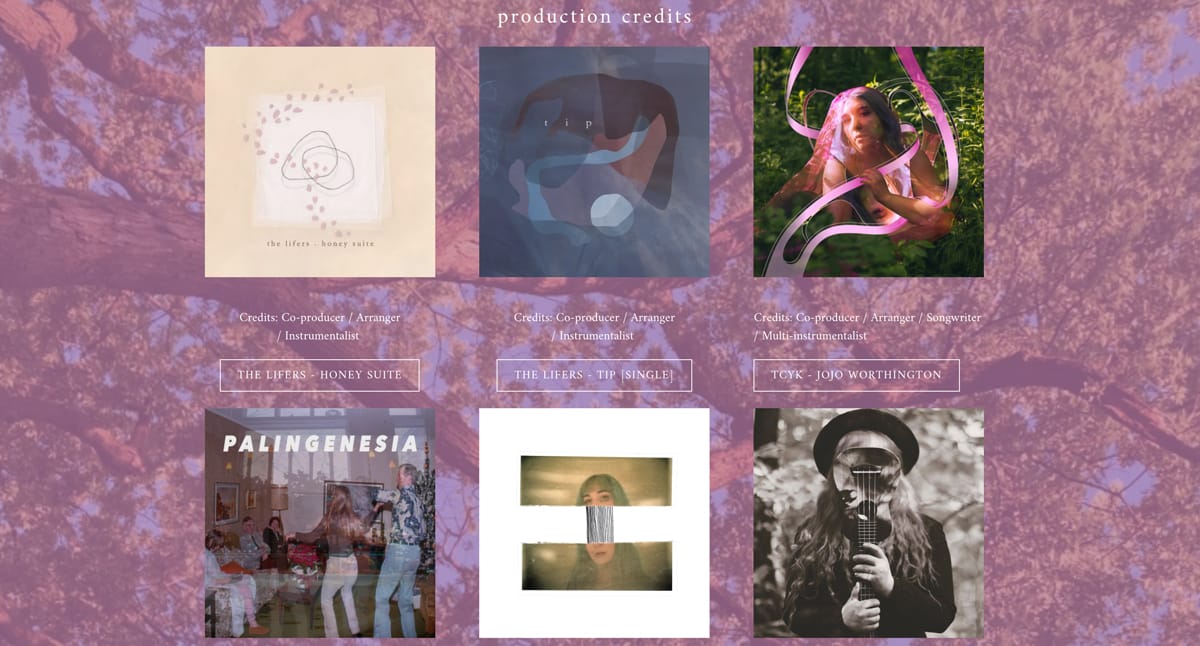
Artist website: Jojo Worthington
To get a similar look, first create a new page or section. To create a new page, under Edit Content click “Pages” > “Add a page” and name the page as needed. Click “Create my page”.
To create a new section, under Edit Content, hover between two sections on your page and click the blue “+ Add a section” button.
Design a stunning website with a custom look and feel that matches your music. Build a website with Bandzoogle now!
I’d recommend splitting a page’s section into two or three columns to start. Under Edit Content, click “New section” (the blue horizontal line within the page layout) and then hover over the section you created, and click “Edit Columns” – then select “2 columns” or “3 columns” here.
To add an “Image and Text” feature, click “Add feature” > “Image and Text” and place the feature in one of the columns in this section using the grey placement arrows. Choose the “Stack” display option to have the button and any text sit below the image.
Then, add an image that represents one project/album/etc, and add any text as needed. If you don’t want any titles/descriptions just remove the prompts from the text fields and leave them blank.
To add a link on this image, click”edit” under the image thumbnail. A menu will pop up beside the image. Click “Link” and then choose your link type – if you are making a discography page, you can link to “An Album” or “A Track” to link to an album or track/single set up on your site. If you are making a portfolio as a producer, engineer, etc, you can link to an “external page” and enter the URL to the project in the field provided. Click Apply.
Last but not least, there is the Button option – to exclude the button, select “No link” under “Button Link”. Or, choose another link type (likely the same link that you applied on your image).
Click Save to save all of these changes. Continue adding “Image and Text” features for all of the items in your discography, project portfolio, etc. Once they are built up, you’ll have a great grid of items for your site visitors to click through.
2. Highlight projects or products on your home page
Another great way to use the “Image and Text” feature is to highlight a few key items on your band website Homepage. A Homepage is a great place to give a brief overview of your latest projects and all that your site offers. Perhaps you have a few exciting announcements to make, or want to lead your site visitors to your new album, your online merch store, or your tour schedule.
You can use the “Image and Text” feature to cleanly highlight these things and link folks over to the inner pages of your site where this content can be found. The use of an image is always handy to capture your site visitors’ attention. This keeps your Homepage looking clean and simple, and promotes more interaction with the inner pages of your site.
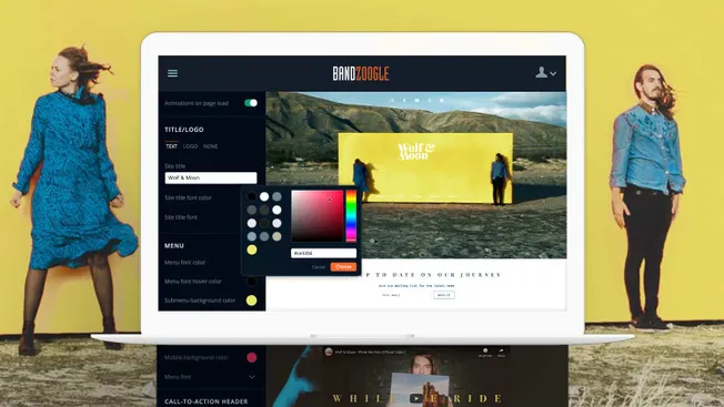
Wolf & Moon and Lightbound Music both do a great job of this on their home pages.
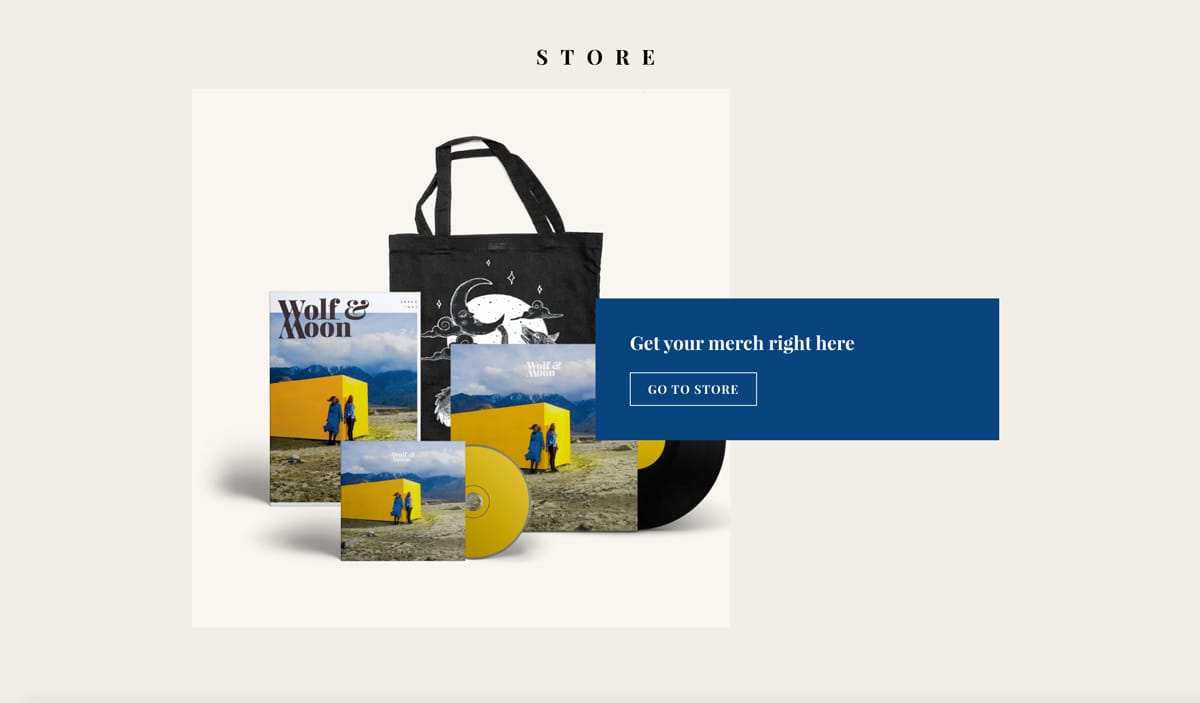
Artist website: Wolf & Moon
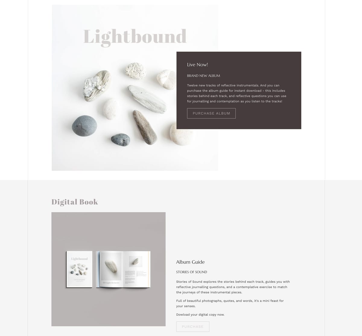
Artist website: Lightbound Music
Note the use of the “Collage” display style on both of these pages. They have customized their website templates to complement their new products/projects so that the background colour of the collage overlay matches perfectly with the artwork.
You can really play with multiple colours here, between your section background colour, collage overlay colour, the button colours, and the colours in the image that you use.
3. Augment your bio to add personality
With the title, subtitle, button, and image options in the “Image and Text” feature, you can add lots of personality when you write your musician bio. You can choose to include or omit any of these items as needed.
Annie Sumi does a great job of this on her Bio page. Annie has placed a quote that resonates with her musical practice in the “subheading” field of the “Image and Text” feature. This gets styled differently and is highlighted at the top of her bio. She has used the “split” display option to have the image sit beside the bio text.
She has cropped her artist headshot image to be a circle – not only does this complement the image, it flows nicely with the themes in her music. To crop an image in your “image and text” feature, click”edit” under the image thumbnail. A menu will pop up beside the image. Click “Crop” here and choose a crop style that works for you. Drag the image as needed to position it and click Apply.
She also has toggled “On” the “Wrap text” switch under “Options” so that the text wraps around the image. This will respond nicely to different screen sizes, and keeps the page layout looking full for the whole length of the bio.
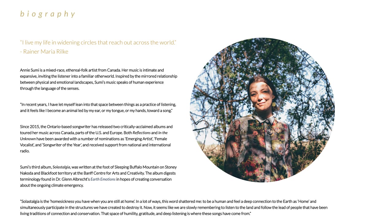
Artist: Annie Sumi
4. Make a super organized EPK
Another display option for the “Image and Text” feature is “Text on image.” This frees up so many possibilities to create some lovely layouts that are very image-focused. This option works beautifully to create an EPK on your website that bookers and other industry folks will appreciate as they can quickly find what they are looking for with one click. I am pulling this example from my own band’s EPK, where the elements are clearly outlined using the “Text on image” option.
Here, I’ve set up a similar layout from the “Landing Page” suggestion above (#1). I used some textural images from a photoshoot we did for our new album, and cropped all of these as circles. Then I added a simple “Heading” for each image and text feature to label the various elements included in our band’s EPK.
Each image is linked to a separate not-in-menu page that holds the content for each category. For example, I have a special “EPK – Photos” page with all of our press photos in it.
Feel free to try this out for a very visual EPK page!
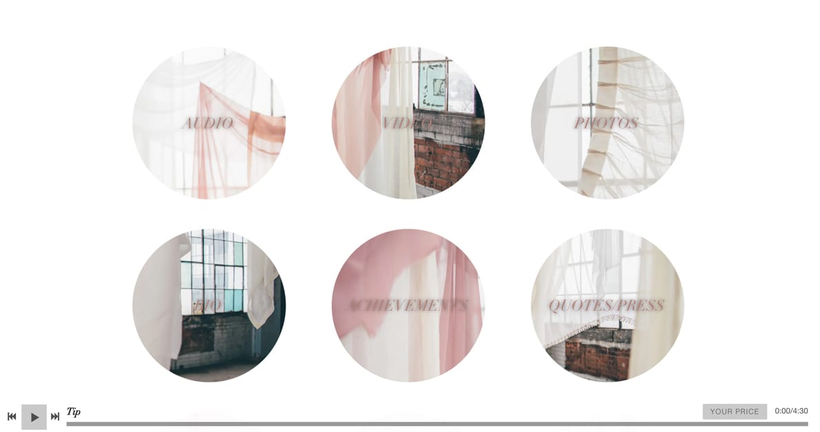
Artist website: The Lifers
5. Create an Info page for Subscriptions, Services, etc.
Many of our members offer amazing services to their site visitors – whether this is selling fan subscriptions or other custom services (music lessons, recording sessions, therapy, etc), we are always amazed at what our members bring to the world.
Jackie Gage has created a wonderful info page for their Subscription offerings. Jackie uses the “Split” display option for the “Image and Text” feature to outline the kinds of services they offer. Jackie makes great use of the Heading, subheading, and button components of the Image and Text feature so that key information is clearly outlined for their site visitors. Wonderful work here!
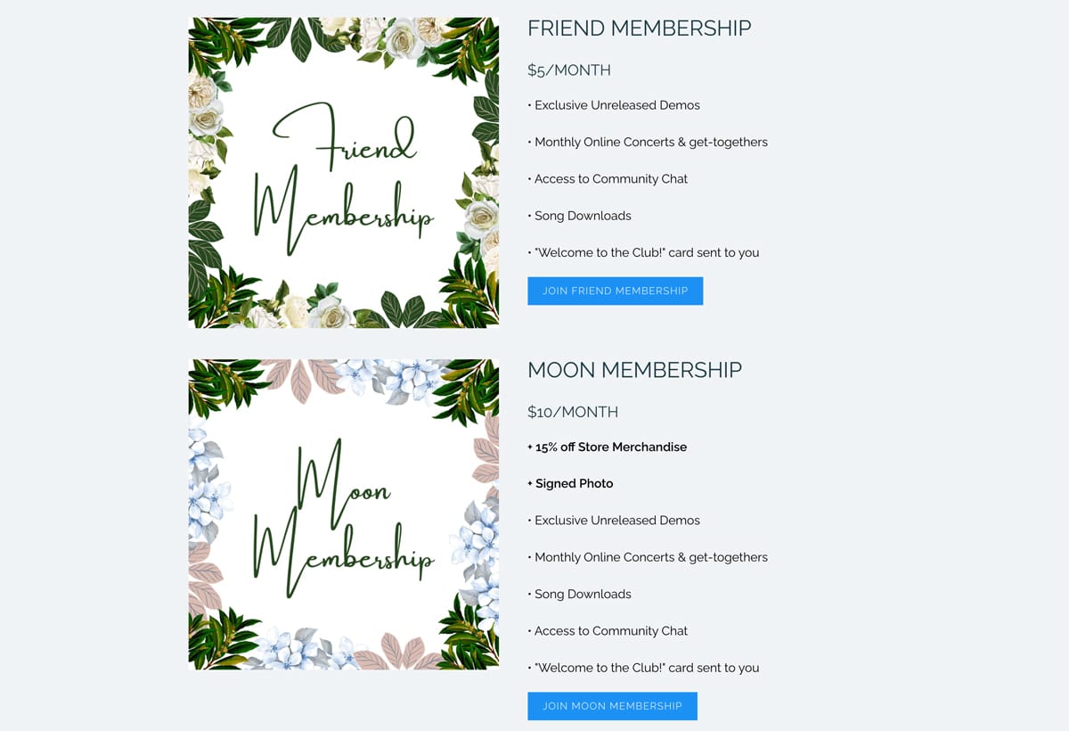
Artist website: Jackie Gage
6 . Use section backgrounds for big impact in your layouts
There is so much power in great imagery. By adding a background image to a section, you will break up the page visually. This break is welcomed by our scrolling human eyes, and that content will immediately pop out as important and exciting. This is another great way to incorporate a call to action somewhere on a page.
The Intune Experience does this beautifully on their home page. They’ve set a lovely textural image as the “section background image” on a section partway through their Home page. They have added a quote from themselves in the “Text” feature, followed by a linked button, calling visitors to book a session.
This layout is perfect, as it gives a personal touch, it is visually interesting, and provides a clear message to engage. Simplicity is truly the key here.
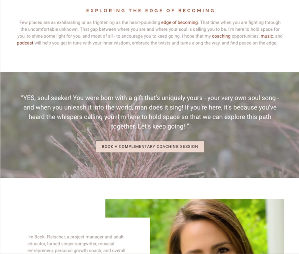
Artist website: Becki Fleischer
7. Have fun with it!
There are so many ways to be playful with layouts if you are willing to experiment a little bit. Here is a great example of a site that plays with the possibilities of layouts using shaped cropping, fun colours, section backgrounds, different column layouts, and more.
Piper Hayes has carved out a great aesthetic on her Vocal Coaching site with the use of circular cropping and the ‘collage’ display option for the Image and Text feature. This site combines a great colour pallette, lovely textural imagery, and fearless personal touches to create a very welcoming online space.
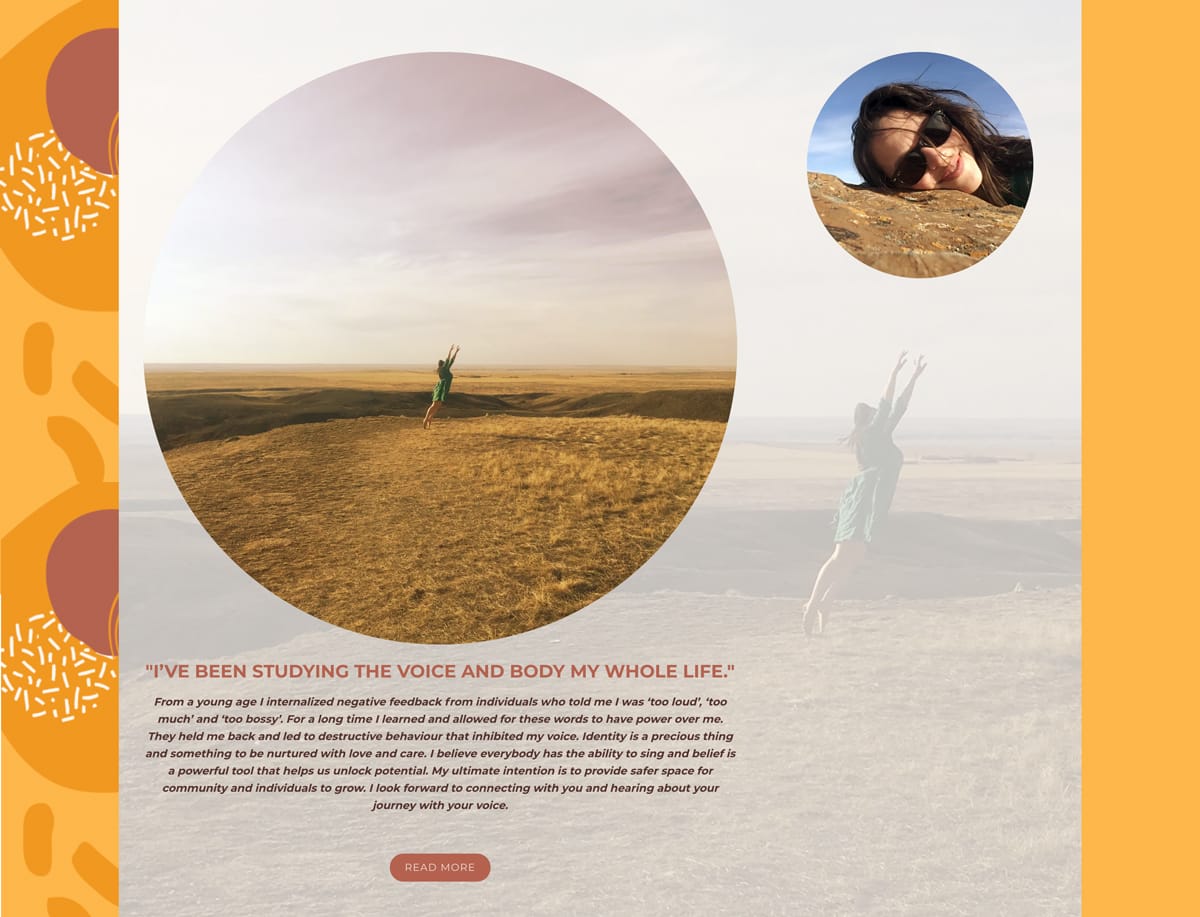
Artist website: Piper Hayes
I do hope this post has helped provide some inspiration for how you can bring personal and aesthetically pleasing touches to your own website by creating different layouts on your pages. Of course, feel free to get in touch with our award-winning support team if you’d like us to take a look at what you’ve created and provide some feedback. We offer free band website reviews to all of our members!