Whether you’re just starting out or you’re an already established act, your music logo is a crucial building block of your brand identity as an artist or band.
by DITTO MUSIC
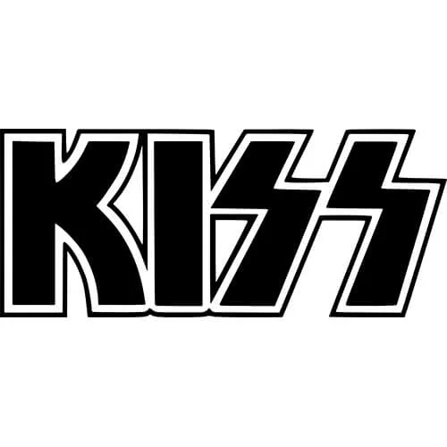
Consider it like this. When you think about some of the biggest, longstanding artists and bands, what visual cue comes to mind? More than likely it’ll be their music logo. The logos of bands like The Rolling Stones, AC/DC and Pink Floyd have arguably become just as recognisable as the bands themselves. For new artists, it’s an opportunity to help fans understand your brand, your identity and the music you create.
How to make a music logo for your artist brand
First off, why do you need a music logo?
For new and emerging artists who are trying to cut through the noise in the crowded modern industry, having your own music logo is a focal part of visualising your overall music brand as an artist or band.
A music logo isn’t just a visual representation of you and your music, it’s also an important way for fans to identify with you and your music too.
Creating your own logo has a number of benefits for new artists, such as:
– Raising your brand awareness and visibility among your fans & target audiences
– Strengthening your brand and identity by adding context to your music and what you/it represent(s)
– Appealing to listeners in a fun way by giving them a tangible emblem to express their own musical preferences and tastes
Once you’ve got a cracking logo down – you can incorporate it within your social media music marketing, your band merch, on your music website & more!
Just make sure you’re completely happy with the final result before you go to print.
7 tips for creating an awesome music logo (with examples)
1. Identify what your logo will achieve
Before you even start sketching out any fonts, images or design, think about what it is you want your logo to achieve.
It’s already a given that your logo will act as a visual identity for your artist brand but dig a little deeper and identify what you as an individual need it to achieve in terms of functionality.
This might be…
– Adding context to your music
– Strengthening an already existing brand identity
– Appealing to fans
– Customising merchandise, featuring on tour posters etc
2. Look to your genre & other artists within it
One thing you’ll probably have already picked up about music logos is they’re heavily genre influenced.
And you’ll see this if you take almost any logo from opposing genres and stack them against one another.
For example, as you can see below, JLS’s logo follows a very approachable, pop music feel, using bubble-style writing, smooth lines and edges.

This contrasts with heavy metal artists like Iron Maiden, who tend to go for ‘edgier’ and spiky shapes and lines in their design.

While indie, alternative and psychedelic artists and bands such as Arctic Monkeys, tend to use either vibrant colours or warpy designs to evoke a sense of trippy, otherworldliness.

Looking at common themes among musicians in your genre will help you atleast get a vague idea that you can use as a general framework before thinking about how you can develop it to make it your own.
Remember – each genre and artist or band of that genre, reflects a different identity. Exploring famous bands and similar artists will help you find inspiration from your own creative pool.
3. Be unique to stand out
With that being said, while it’s definitely worth looking to others for inspiration, your logo should be an original expression of you and your music.
What makes you different from artists in your genre? Or outside it? How could you utilise or reflect your musical USP in your logo design?
A great way to come up with an iconic design that still resonates with your fans is to believe it or not – ask them.
Take to social media and ask fans to leave a comment telling you what makes your music unique to them and what they associate it with. Or you could even encourage them to submit drawings or designs with a prize for the chosen submission (top points for UGC and strengthening that all important artist to fan bond!).
Here’s some other ways to give your logo the unique factor:
– Take inspiration from your lyrics
– Design your own customised font (or if you can afford to, pay someone else to do it for you!)
– Think about memorable, iconic imagery that’s meaningful to you
4. Pay close attention to colour
Colours are one of the most important parts of any logo – even if there are none!
Why?
According to human psychology, colours elicit emotional responses – which means different colours can have different effects on different people.
So when thinking about the colours you’ll incorporate within your music logo, you’ll want to spend some time researching which colours hold specific connotations or common associations – and whether or not they align with your brand identity.
For example, red traditionally represents love, passion, anger and danger. Yellow on the other hand evokes warmth and happiness. While green is usually associated with freshness, energy and youth.
A good of example of this is The Red Hot Chilli Peppers. They use the colour red prominently throughout their logo to not only reflect the identity of their music, but also as a direct reference to the ‘red’ chilli peppers in their name.

Limiting your use of colour could also work in your favour.
Monochromatic colouring is very effective in music logo designs. Simple colour schemes can help create subtle messages through highlights and accents – plus it’ll save you some $ on printing costs!

5. Consider use of imagery
The general advice from experts is to limit the number of images in your logo and go ham on the other design elements – like colour and fonts – instead.
But this doesn’t mean you can’t still get creative and experiment with form and shape.
Take both bands The Rolling Stones & Guns N’ Roses as examples.
The Rolling Stones use a memorable image that captures the essence of sexuality within their brand identity – but use no writing at all.

While Guns N’ Roses go the other direction and feature literal imagery of the objects mentioned in their name (i.e. guns and roses) as the focal point of their design.

The point is – both types work.
And remember, the image you use doesn’t need to be a detailed work of art. Some of the best and most recognised music logos of all time are simple images that anyone could scribble down on the back of a napkin. Or funky cool designs that look great on a t-shirt or piece of merch.
Also – if the image isn’t legally yours, don’t use it. Unless you want to get into a copyright infringement dispute…
There’s loads of free stock image sites you can use to gather image inspiration. Some of our favourites include Unsplash, Pixabay and Pexels.
6. If you’ve got it, font it
Arguably the most identifiable part of your music logo will be the font or typography choice you use.
You’ll use your font to incorporate your artist or band name into the logo – so the font you choosematters.
If you have the devices at your disposal, it’s better to design your own font than to use an already existing one. Heavily used styles like ‘Times New Roman’ and ‘Arial’ come with the risk of existing connotations attached to them. Having a font that’s individually yours will enable you to better highlight your identity and establish a sense of brand cohesiveness.
Fonts are also very genre-based and will consciously or subconsciously send a message to fans about you and your music.
For example, heavy metal bands like Metallica are known for their sharp use of lettering.

Gorillaz are another great example, using a graffiti art style font as a conscious nod to the band’s hip hop roots.

7. “Simple is as simple does”
Last but not least, as a general rule of thumb – keep things simple.
Minimalism isn’t just a passing trend – there’s a reason famous music logos have stood the test of time. And a lot of that comes down to their timeless, instantly recognisable quality.
Plus the simpler you keep things, the more diversity your logo has for usability across different platforms, mediums, occasions etc. (all subject to slight tweaks or alterations of course).
For example, your different social media accounts will mostly likely need a simpler, abstract version of your logo, compared to the version you use across your touring posters which would arguably work better with some intricate markings.
One final thing – make sure the size of your logo image is optimised for use across different platforms.
Check out our music platform image sizes cheat sheet & social media image sizes cheat sheet for the down-low on this!


