Music Tech

A Look Inside Spotify’s Redesign Process

IconIn the wake of a recent overhaul and update of their icon suite, Andrea Limjoco and Rob Bartlett discuss the four month process of building and implementing the six hundred individually crafted icons in order for them to function well on all of Spotify's various products.

_____________________________

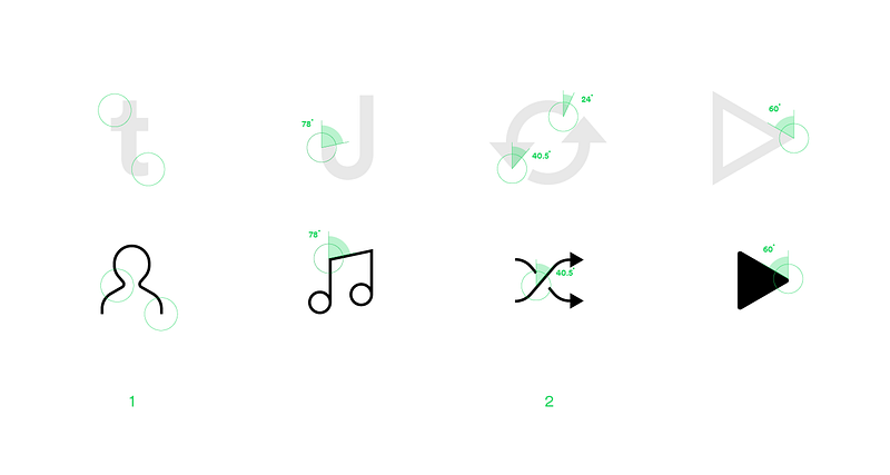
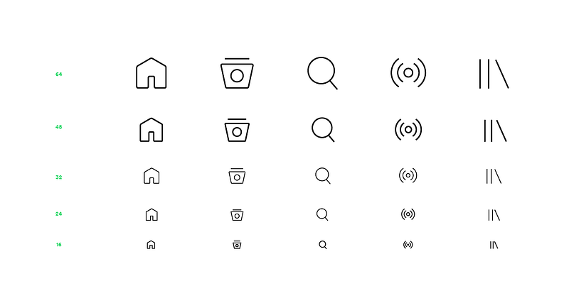
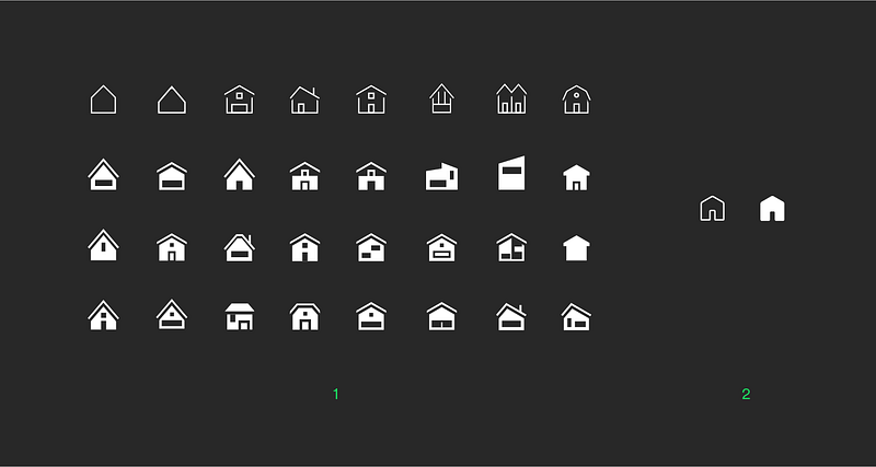
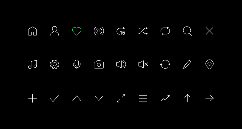
Guest post by Andrea Limjoco and Rob Bartlett

Updating the Spotify icon suite was a four month process of creating and implementing six hundred individually crafted icons that had to look and function well across all of Spotify's products.

Redesigning an entire icon suite (which hadn’t been updated in 3 years!) was a bigger task than what we anticipated. We encountered 3 key challenges that helped inform these icons:

1. Visual:

We wanted to design an icon suite that was original and bold (in style) to reflect our brand. At the same time, we wanted the icons to be simple and remain elegant over time.
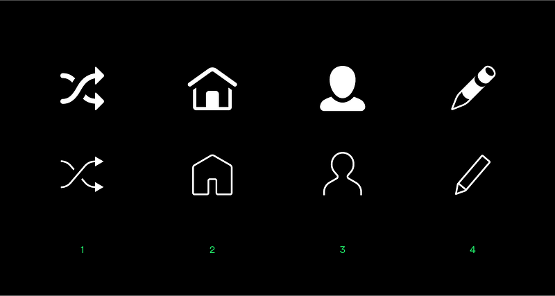
Some core improvements: (1) consistent stroke width, (2) clean and simple shapes, (3) outlines over solid and (4) flat shapes over 3d forms

The new icon shapes were designed to mirror our Circular typeface — its sharper forms inform the overall icon style — creating a set that felt unique to Spotify. We also made sure that these icons were drawn in their simplest form, really considering the bare minimum needed to convey the idea behind the icon.

While designing the icons, we took inspiration from our Circular typeface — characters and glyphs: (1) a combination of round and sharp corners, (2) A use of common angles to define the overall style of our icons. Other characteristics such as the proportion and strength of the type also feature heavily.

2. Functional:

Spotify is increasingly on new platforms and screen sizes, as our business grows we needed to think about creating a flexible icon set to support that. The old icons were too complex and the visual metaphors were difficult for users to understand — which presented challenges when used in different sizes for all of our products. The new simple shapes, meanwhile, made it easier for us to implement icons that responded to any range of sizes, screens, and use cases.

We identified common icon sizes across the product and increased the breakpoints to ensure pixel perfection. Each icon was then created in 5 custom sizes and, at the end of the process, we had over 600 individually crafted icons.

3. Contextual

The final challenge was ensuring each icon adapted well in different pages, views and features. At the start we had mapped out all the icons in all our Spotify products and planned to design every icon around its context. We thus needed to spend the first few weeks talking to teams, engineers and designers to understand their specific needs.

By doing this and looking at each icon in context, we were able to identify the issues with the old icons on both visual and interaction levels. Furthermore, the simplified and responsive icon set helped improve some core interactions in our product, helping make our new navigation model simple and more accessible, for example.

Designing with constraints

The biggest learning, however, came from the process we used for this project. We forced ourselves to remain creative and open minded within very specific design, technical and product requirements.

(1) We explored different variations of the home icon shapes. (2) But ultimately, we ended up choosing the simplest one. This is a principle we kept in mind as we designed the rest of the set.

We researched the technical and product constraints up front, and began our design process from there. Identifying these early on saved time, built trust across other functions at Spotify in what we were doing, and helped us create an icon language that is a balance between form and function.

We hope you like it! — @spotifydesign

Share on: