_____________________________
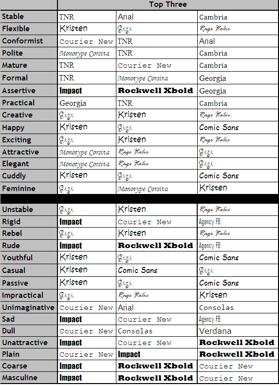
Guest post by Bobby Owsinski of Music 3.0Everyone in the music business is ultimately a brand, and the ones that develop theirs are ultimately the most successful. Artists, bands, musicians, producers, even indie record labels, have a tough time discovering their brand though, and in some cases they don’t know where to start. In the second edition of my Social Media Promotion For Musicians handbook there’s a specific chapter on branding that describes how to begin with 3 easy things – settling on a name, picking a color, and picking a font.The name causes a lot of confusion sometimes because people will use a one that they’re not comfortable with instead of what feels or sounds right. Some easy cases here goes to first names, where an artist might call himself Victor when he really feels better with Corky, or Maureen instead of Mo.Picking a color is similar, where although there’s a great deal of science around colors, there’s also personal preference that goes with your brand. You don’t want black or brown when your image is flowery, or blue when it’s hot and passionate. You must pick a color and use it everywhere (website, social profiles, posters, business cards, etc.) for it to be effective.Picking a font that describes you is also one of the keys to a brand but it’s a little more difficult because there are so many. Like a color, you have to use it everywhere once you pick it, but what to choose? We touched on this a bit last week on the psychology of Netflix fonts, bu there’s way more to it. Luckily there is some guidance with the help of this handy chart.