By Aaron Skipper, Creative Director of Explorers Club
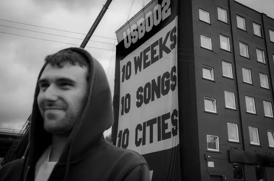
When Fred again..'s USB-002 tour identity launched, there were no glossy visuals or complex graphics trying to impress the industry. Instead, at the center of everything, from a six-story-high flag drop announcing the tour, to bespoke-per-city venue backdrops and merch, was a stark black and gray flag.
One idea. No decoration. Just simplicity and clarity, with a consistent visual language for fans to be part of, in real time.
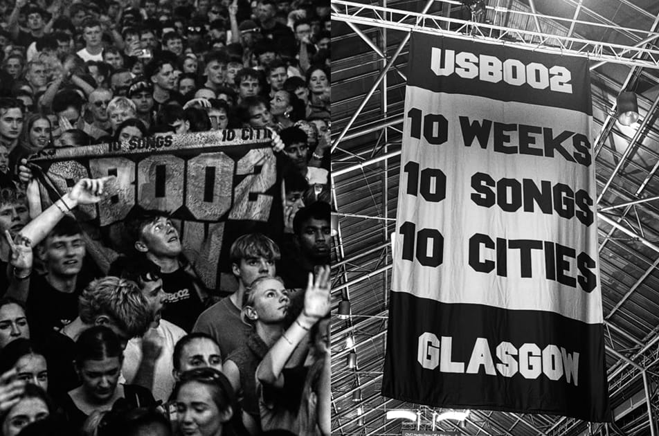
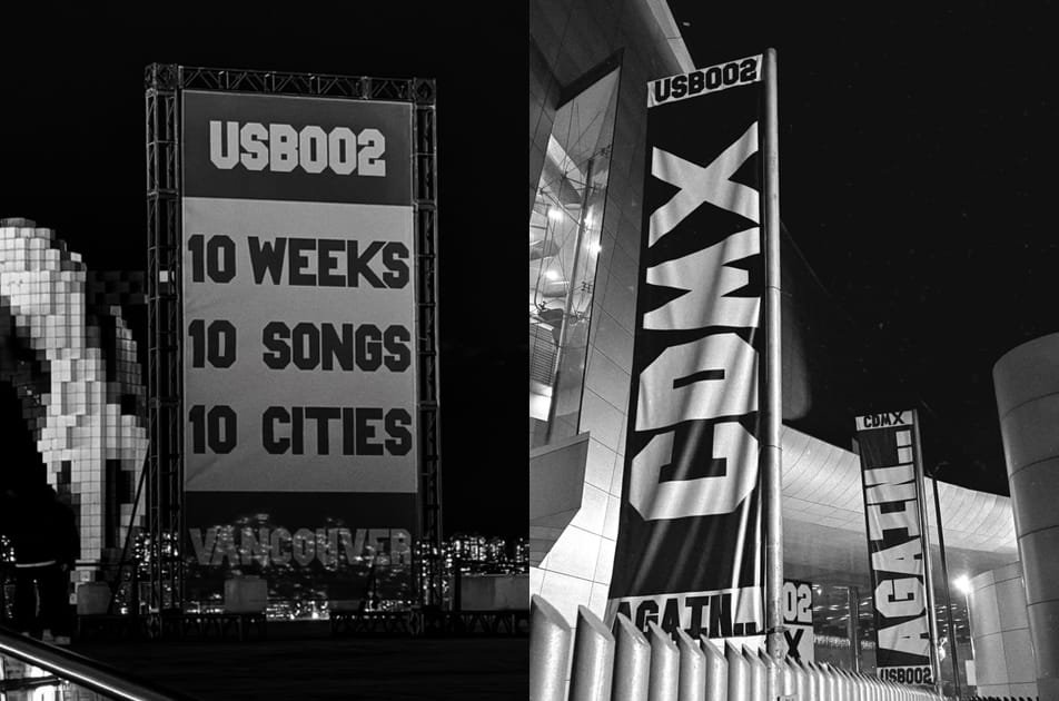
One flag, adapted for each of the 10 cities, delivered to weekly media deadlines, from billboards and building wraps to flag drops, from Glasgow to Madrid to New York. The morning after that first show, social feeds immediately flooded with that image: different lighting, different crops, fan-captured drone shots, and one person who even hand-painted the launch flag in watercolors on their train home.
"In a landscape where every design battles for attention, we found that stripping everything back gave ownership to the people who matter most: the fans."
Start With Behavior
The strategy was built on the belief that clarity cuts through noise. In a landscape where every design battles for attention, we found that stripping everything back gave ownership to the people who matter most: the fans.
We spent time understanding how Fred's audience experiences live music, recognizing that this community already had a language around togetherness, and that we needed to give it a form they could activate. The visual and sonic worlds should multiply each other.
When you get it right, you take a live spectacle and turn it into a shared, multi-sensory experience, something the audience can inhabit, remix, and carry forward, all in real time.
Build to Travel
There is often a temptation in design to over-deliver, to layer meaning, detail, and polish until the work feels undeniable and to justify your invoice to your client. But when something is over-designed, it can feel like it was made for the industry rather than for the fans. We were conscious of that from day one.
Fred's existing visual world is super minimal and deliberately under-designed; his music feels raw and immediate. The visual language needed to mirror that without offering a copycat. We wanted something that felt analog and tactile up close, but cinematic from afar. The brief was clear: monotone only, lo-fi, concepts and visuals simple enough that everyone would understand and relate to them.
For USB-002, this came through a hand-cut typeface, analog craft, and emotion over rules.
Each city had its own version of the flag, the same system, just different local iterations. We used the modularity of the flag and its classic 2:1 ratio to create a cohesive global identity with distinct local expressions.
In Glasgow, a massive flag wrapped the venue entrance, setting the tone before fans even walked inside. In Madrid, it scaled onto a massive screen. In Lyon, it adapted to an old cathedral facade. The flag logic, balanced divisions and proportions, remained intact throughout, allowing the system to move at the same speed as the tour.
Each of the 10 shows sold out within minutes.
Create Local Belonging That Can Scale
The symbolism of a flag represents togetherness and community. While flags can be contentious symbols right now, Fred's music provided a space to re-own that symbol of togetherness.
Even on a global tour, fandom is experienced locally – in a specific city, on a specific night. The power of a simple core idea is that if everyone understands it, you can scale it quickly and seamlessly without breaking the system. Simplicity is elastic: it can be pulled tight or stretched to its limits, but because it's clear at its core, it holds. When Fred extended the tour with residency dates across London and New York, the identity extended with it.
+Read more: "Black Box’s Livia Tortella on Her Top Artist Brands of the Decade"
Make the Audience the Identity
The USB-002 tour launched with the above video of Fred unfurling a 60-foot flag off the side of a building, an invitation to his three million-plus followers that fans accepted immediately. They photographed it, reinterpreted it, and proudly shared their city's version as a badge of having been there that night, a marker of belonging. The flag became a backdrop for fan-first participation and memory-making.
That same approach extended to merch, with city-specific designs that let fans take home their piece of the tour, a marker of belonging rather than just a souvenir.
When the audience carries the work forward, it feels more meaningful than any traditional KPI. That is culture living on beyond the spectacle. The goal is to ensure fans don't feel like passive spectators, but active participants.
Design Systems People Want to Live With
The most powerful tour identities transform venues into something the audience exists inside together. Boris Acket's ceiling installation captured that perfectly, a vast flag, slowly undulating above thousands of people, moving with the music, the light catching it differently from every angle.
As an industry, we can be guilty of chasing culture, trying to attach ourselves to moments that already exist. But the only way to get close to culture is to create it. That doesn't mean forcing spectacle; it means designing systems people want to inhabit and extend.
For USB-002, the flag was primarily an invitation. When fans accept that invitation, reinterpret it, and share it, the identity stops belonging to the artist and starts belonging to the community.

Aaron Skipper is co-founder and creative director at Explorers Club, a strategy and design studio based in Los Angeles. He has spent 12+ years in the creative industry working with the world’s most revered brands and individuals, most recently Apple and Nike. Aaron is an Emmy Award Winner and has also won multiple Cannes Gold Lions, D&AD Yellow Pencils, and was named 7th in the Art Directors Club leaderboard in 2024 for Design.
Fred again.. Live Tour Dates
FEB 26 — London, United Kingdom @ Alexandra Palace
FEB 27 — London, United Kingdom @ Alexandra Palace