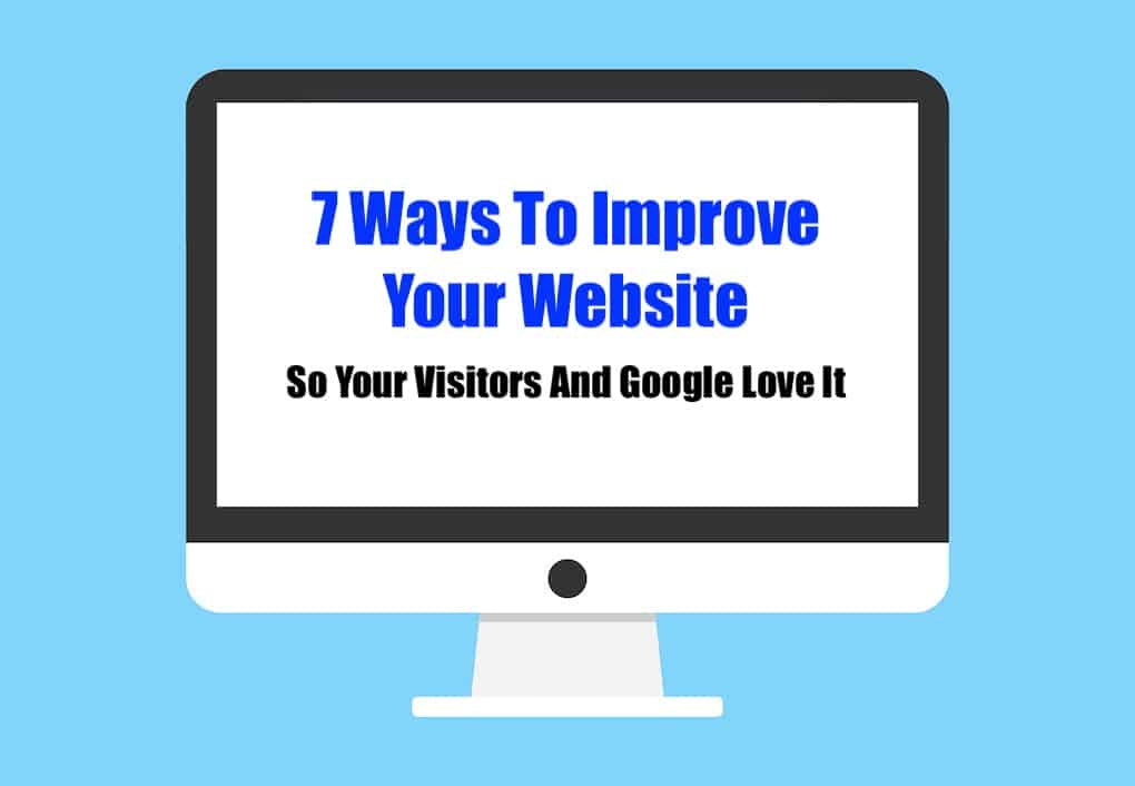
Artists have so much on their plate, that maintaining a website can seem like too much. Here are 7 tips to improve your website, for you and your fans.
A guest post by Bobby Owsinski of Music 3.0.
For many of us, websites are a necessary evil. We know we need one but we don’t update it nearly enough. The problem is that if it looks dated it could cost you some visits, and if it doesn’t live up to what Google currently expects then you won’t rank as high in a search. Here are some of the things that you can do to improve your website the next time you decide to refresh it (check here for more).
#1 – Make It Load Fast
It’s a fact that 40% of visitors will abandon a website if it takes 3 seconds or more to load. Graphics are usually the cause and the easiest way to slash to load time is to use fewer of them, and make sure the size is as small as you can get while maintaining clarity on the ones that you do use. 100kB total for the page is what to aim for. Just so you know, Google penalizes you for a slow load time.
#2 – Make It Mobile Friendly
These days the majority of people will visit your site by using their phones, yet so many sites only optimize for desktop. It’s frustrating when the font sizes are too small to see or too large navigate. Remember that Google now penalizes sites that are not mobile-friendly.
#3 – Make The Navigation Easy
The fewer links available on your main menu, the better. People want simple choices, so limit the number of links to what’s absolutely necessary. People also have an aversion to drop-down menus, so limit those too.
#4 – Make It Responsive
You need a theme that automatically resizes to the browser window that the site is displayed in. Most themes will do this these days, but if you choose one that doesn’t resize, expect push-back from you viewers and another penalty from Google.
#5 – Focus On Just One Thing
Your artist site may display your music, and that’s what it’s there for, so there’s no need to clutter things up with info about your hobbies or passions on the main landing page. That just confuses your visitor. The ideal is to have the page title (which is probably your name) and the purpose of the page or a subtitle at the top of the page above the fold (before you have to scroll down). Having a call-to-action (“Click To Listen”) there is a good idea as well.
#6 – Be Stylish, Not Garish
Just about every site theme has a multitude of options these days but we don’t want to or have to use them all. Limit the background colors to 2 (one neutral and one bright) with a contrasting color for the text and maybe an additional color for a headline.
#7 – Make It Easy To Read
Just because you have a lot of space on the page doesn’t mean you have to use it. Make use of some white space to make sure that the site stays focused and stays easy to read. Too much copy or multiple graphics and videos are confusing to the eye.
Remember that your Google search ranking depends more and more on the user experience of your site. The better that experience is, the more likely your visitor will stay around to find out more about you, and the higher you’ll rank in a search. These 7 tips to improve your website will go a long way to that end.
Bobby Owsinski is a producer/engineer, author and coach. He has authored 24 books on recording, music, the music business and social media.
Read more: https://music3point0.com/2021/12/01/7-ways-to-improve-your-website-so-your-visitors-and-google-love-it/#ixzz7DrYhOPMU
Under Creative Commons License: Attribution Non-Commercial Share Alike